DIRECTIONS FOR MAKING A STACKED COLUMN GRAPH WITH EXCEL 2007AP LAB 11-Animal Behavior (Pillbug preferences)
1. Open an Excel spreadsheet
2. Enter sample times in 1st column, and your data for pillbug counts in columns 2 and 3 (as shown below. DO NOT put a heading on the time column or it will be treated as a variable
|
WET |
DRY |
|
|
0 |
5 |
5 |
|
0.5 |
|
|
|
1 |
|
|
| 1.5 | ||
| 2 | ||
| 2.5 | ||
| 3 | ||
| 3.5 | ||
| 4 | ||
| 4.5 | ||
| 5 | ||
| 5.5 | ||
| 6 | ||
| 6.5 | ||
| 7 | ||
| 7.5 | ||
| 8 | ||
| 8.5 | ||
| 9 | ||
| 9.5 | ||
| 10 |
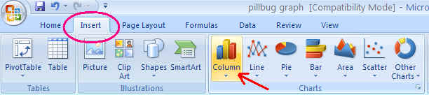
3. Click on and highlight all the data cells (including the blank in A1)
4. Choose INSERT, then COLUMN in the Chart tool bar.
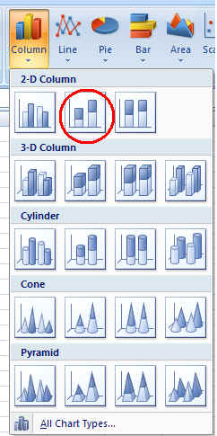
5. Choose the 2nd choice in the first line of the pop up window for bar graph choices.
6. Graph should appear on your spreadsheet.
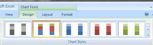
If graph is highlighted, CHART TOOLS are visible.
Choose Design and you can change the colors on your graph.
8. Make sure graph is highlighted. Choose Layout, then click on Chart title, and
choose the location of your graph title. A text box will appear. Type in your
Graph title. 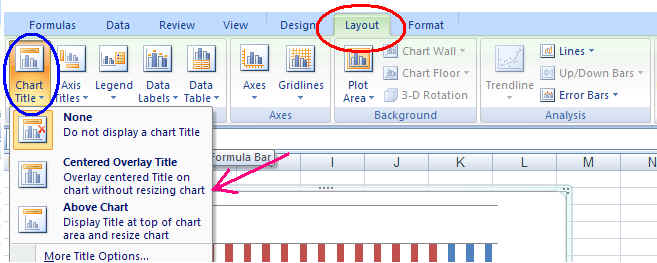
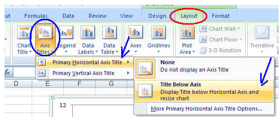
9. Add a label to your horizontal axis. Make sure
your graph is highlighted. Choose Layout, then Axis Titles. Choose Primary
Horizontal Axis Title, then Title Below Axis.
A text box will appear. Type in your horizontal axis label. Remember to include
units!
10. Add a label to your vertical axis. Make sure your graph is highlighted. Choose Layout, then Axis Titles. Choose Primary Vertical Axis Title, then choose the appearance of your vertical axis label.

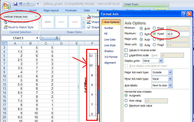
11. Change to MAX value on the vertical axis scale if it is greater than the
maximum bug count value. Highlight the number scale on the vertical axis.
Choose Vertical value Axis. From pop up box, click on Maximum: Fixed and put in
the Maximum value you want the graph to show.
12. Save your spreadsheet.
13. You can highlight your graph and copy and paste it into your lab report.